
Is aid for nutrition going to countries that need it most?
In the lead-up to the 2020 Nutrition for Growth (N4G) Summit in Tokyo, many will rightfully argue that more investment for nutrition is needed across the board if we are to meet the World Health Assembly (WHA) targets by 2025 and Sustainable Development Goals by 2030. Our recent research confirms this.
But, in addition to the need for an increased overall quantity of funding (from both domestic and donor sources), there may be scope to increase the equity and efficiency of donor aid for nutrition by mobilizing additional resources for countries that are currently being left behind.
In 2017, R4D was part of the consortium (led by the World Bank and supported by 1,000 Days) that created the Investment Framework for Nutrition as a roadmap toward achieving the WHA nutrition targets by 2025, with financial investments needed from domestic governments, donors and other sources.
R4D’s work to track progress in donor spending based on the investment framework for nutrition suggests that donors are holding up their end of the bargain; our most recent research indicates that donors have managed to increase their funding for a “priority package” of interventions substantially over the last 3 years (though more is still needed).
While the overall trend at global-level and donor-level is fairly positive, this does not address an important question: is aid for nutrition reaching all the countries that need it most?
We are currently conducting a detailed analysis of this issue, and plan to present findings at the Federation of African Nutrition Societies conference in Kigali, Rwanda, in August. But in the meantime, we wanted to share some initial ideas with the nutrition community — as well as some tools to allow others to look at this issue as well.
How should we think about the ‘need’ for nutrition aid?
There is no clear definition on country “need” for nutrition aid. Different donor institutions consider different criteria in making their allocation decisions, sometimes including measures of need but also considering a number of other factors. However, two simple principles that are commonly raised in the literature on development assistance for health are: 1) countries with higher disease burden probably need more support; and 2) countries with higher ability to self-finance programs domestically probably have less need for external support. While individual donors make funding decisions in their own way, a review of whether aid allocation is broadly in line with these principles can help inform current approaches in promoting more equitable and effective allocation of donor resources.
It is not straightforward to apply those principles. Despite some flaws, GNI per capita is often taken as the best proxy for a country’s ability to self-finance development programs; but below some threshold it may make sense to consider all countries to have very low ability to self-finance. Disease burden is even more challenging in the case of nutrition, as there are multiple burdens of relevance, such as stunting, wasting and anemia, and no universally accepted way of aggregating these into a single metric.
Given these challenges, we won’t try to come up with a definitive answer on exactly how much aid each country should get in this post. But, even with the different options, we think it’s possible to identify some countries that are being left behind.
What does the data tell us?
In this simple analysis, we take a couple of approaches:
- We assume that all low-income countries (LICs) can be considered to have low ability to self-finance programs, whereas lower-middle-income countries (LMICs) may have varying ability to self finance as their GNI per capita increases. This is an arbitrary choice, but consistent with how some forms of aid are allocated, such as the Global Fund, for example. The Global Fund’s aid allocation formula treats all LICs as having the same low ability to self-finance their own development, while LMICs are treated as having more varied levels of ability to pay and thus more varied levels of “need” based on income.
- To take into account different population sizes and burden levels, we create some standardized metrics relating aid levels to burden levels, e.g. amount of aid per stunted child. This helps to simplify comparisons across different countries — if aid were allocated purely on burden, we might see roughly the same amount of aid allocated per stunted child across most countries. Nonetheless, given countries might have quite different patterns of malnutrition, a country might be receiving a high amount relative to one burden metric but a lower amount relative to another.
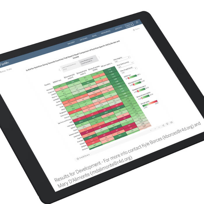
Using these data, we created some interactive heat maps in Tableau, which are available here for anyone to experiment with. A few of the key messages emerging are as follows:
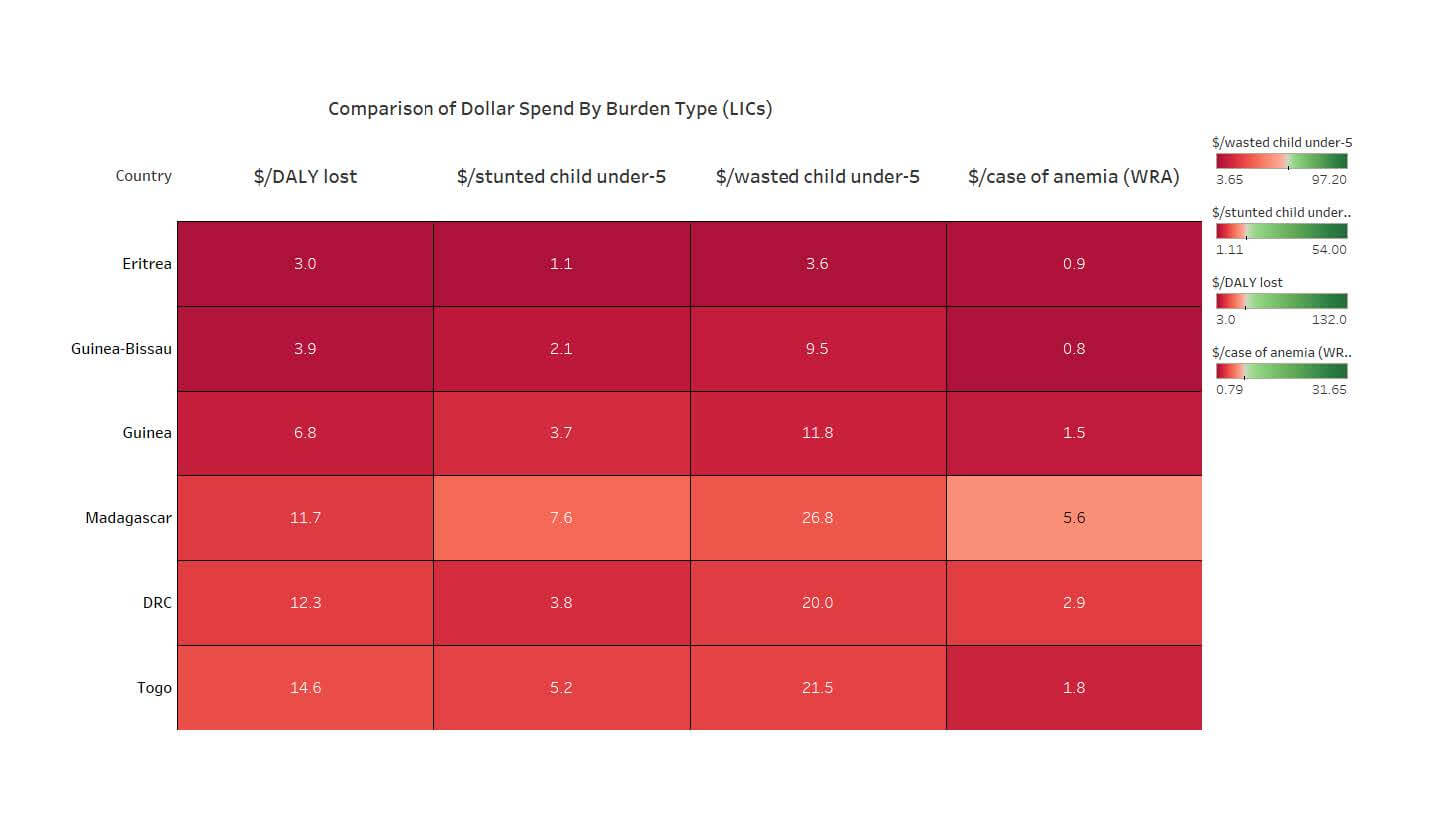
No matter what burden metric you use, some LICs seem to be receiving a lot less nutrition aid than others. We look at every dollar spent per stunted child, wasted child, anemic woman of reproductive age (WRA), and a composite metric of the amount per DALY lost due to nutritional deficiencies. No matter which metric you use, some countries are showing up “red” across the board, because they simply are not receiving much nutrition aid. The extract from the heat map below shows 6 countries with consistently low funding relative to burden. These are all in sub-Saharan Africa, are generally fragile (though many LICs are), and are non-Anglophone.
Figure 1: Comparison of Dollar Spend By Burden Type (LICs)
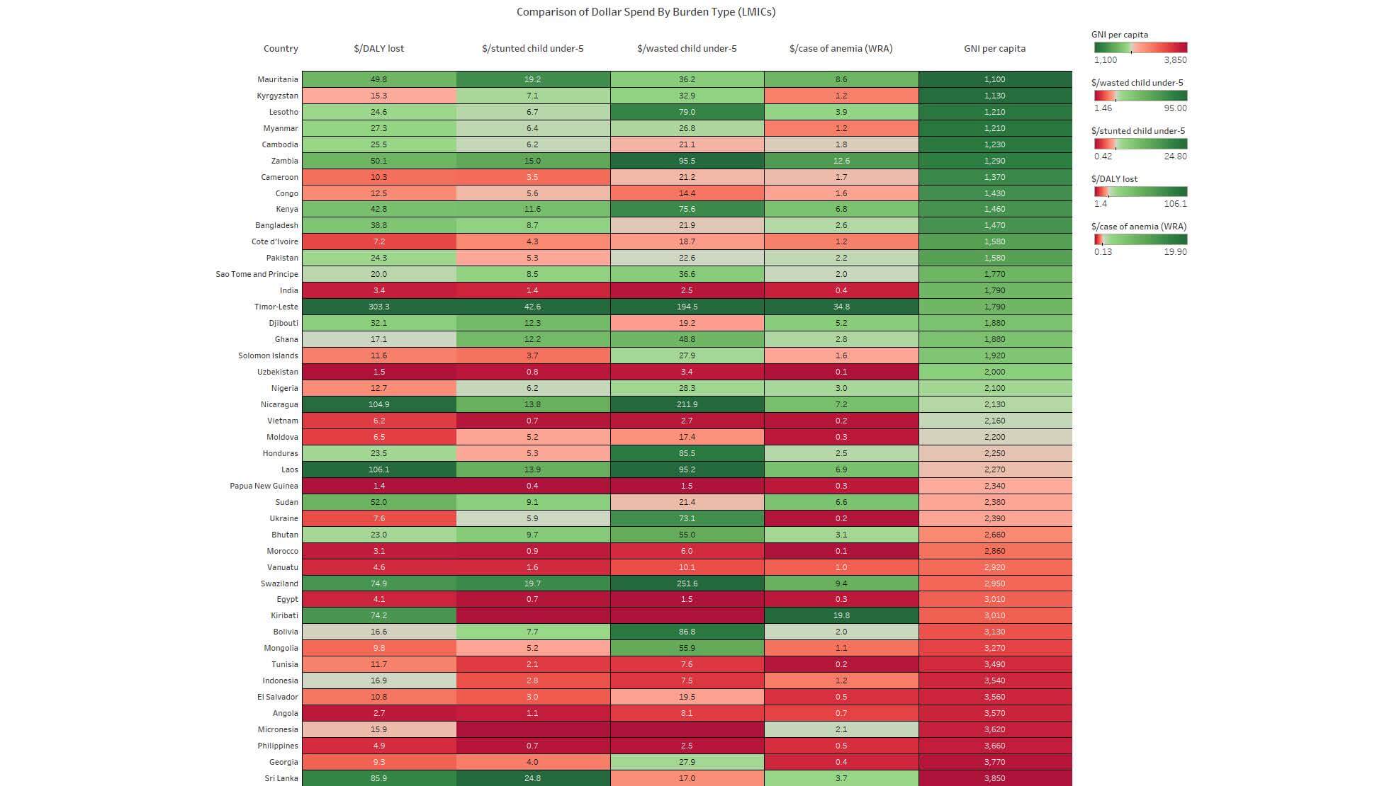
Among LMICs, we do see, as expected, a pattern where countries with lower GNI per capita tend to receive more than those with higher GNI per capita. In the LMICs heat map, as income increases (and hypothesized need for external aid decreases), the amount of aid relative to burden is also decreasing for the most part. Overall, the color shift from green (low GNIpc) to red (higher GNIpc) in the right column is generally reflected in the other columns.
Figure 2: Comparison of Dollar Spend By Burden Type (LMICs)
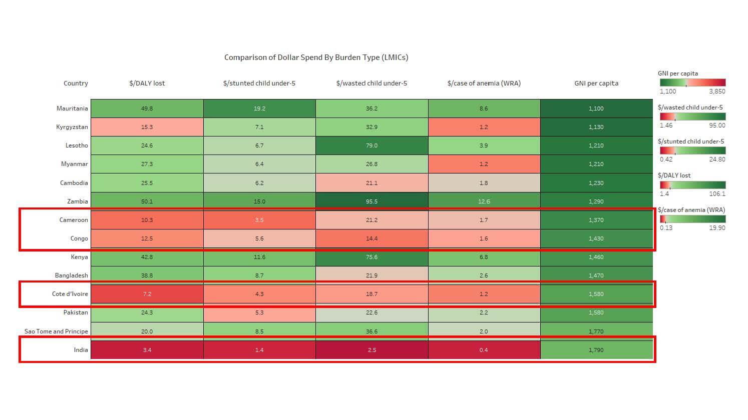
However, there are some LMICs with lower GNIpc who also have low levels of aid relative to burden. Zooming into the 14 lowest-income LMICs, four of them are dark or light red across all the aid measures. India is its own case — despite having a high burden, India does not seek commensurate amounts of aid to support development programs, and is a donor in its own right. The other lowly-funded countries, Cameroon, Congo and Côte d’Ivoire are again all Sub-Saharan Africa, all Francophone, and 2/3 are considered fragile.
Figure 3: Comparison of Dollar Spend By Burden Type (LMICs)
Where do we go from here?
While these simple analyses are not definitive, they strongly suggest that there is scope to improve the equity and efficiency of donor aid in the future — something we hope will receive consideration and attention in the run up to the Nutrition for Growth Summit.
The analyses also show some patterns that may be worth exploring further, to better understand why some countries appear to be left behind when it comes to nutrition aid. Additionally, it’s also important to recognize that national-level metrics on can hide large disparities in malnutrition and overall resources received at the sub-national level. As such, there’s a need for improved resource tracking at the country level to better understand this.
We hope to share more on these questions soon from our own analyses — but, in the meantime, we invite you to explore the heat maps yourselves here and see what patterns you see. We look forward to hearing your insights!
***
Technical Note
Disbursements represent WHA-aligned nutrition-specific aid, average annual disbursements between 2015 to 2017. Data was drawn from the OECD Creditor Reporting System and analyzed by a research team at R4D. For more information on methodology and assumptions, please see our most recent report on tracking aid for the WHA nutrition targets here.
Reading the heat maps
The upper range of the color scales are set at the highest non-outlier value for each burden measure (i.e. we only set the color scale using non-outlier values to have a more representative color gradient). Additionally, the center of each color scale is is set at the median value of each variable to get a more evenly distributed color range).
References
OECD.Stat. 2019. “CRS 2017 Data.” 2017. https://stats.oecd.org/Index.aspx?DataSetCode=CRS1
Global Nutrition Report. 2019. “GNR 2017 Dataset.” 2017. https://globalnutritionreport.org/reports/global-nutrition-report-2018/dataset-and-metadata/
Photo © USAID/Morgana Wingard